
Vibrant Visuals for Spring-Summer - Choosing the Right Palette
Spring and summer bring longer days, more foot traffic and more eyes on your billboard than any other time of year. But here is the catch: if your colours do not work in direct sunlight, your message disappears before anyone reads it. Getting your summer colour palette right is not about what looks good on screen. It is about what survives the real world.
Start with Contrast, Always
The single biggest mistake Canadian and US brands make with seasonal billboards is choosing colours that look beautiful in a design file and wash out completely outdoors.
Your audience has four seconds. High contrast is what makes those four seconds count.
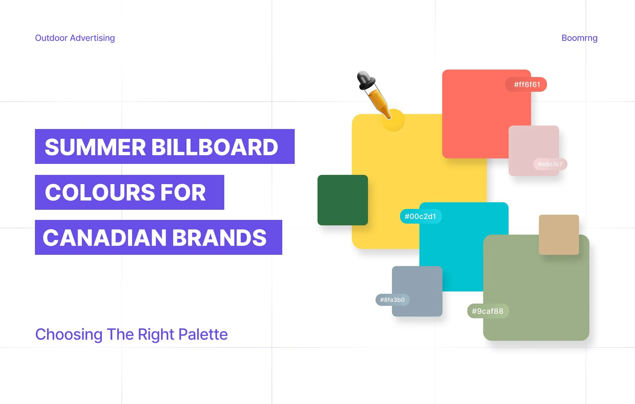
Combinations that hold up in summer light:
Black text on yellow
White text on deep navy or red
Dark charcoal on white or cream
Combinations to avoid:
Pastels on pastels
Light grey on white
Any two colours from the same tonal family
Research shows high contrast improves billboard recall by up to 38%. That number alone should settle the debate.
What the Summer Colour Season Actually Means for Outdoor Creative
The summer color season is bright, saturated and high energy. That works in your favour outdoors, but only if you lean into it intentionally.
A color palette analysis for billboard work is less about beauty and more about visibility. Ask yourself: does this colour read clearly at 80 kilometres an hour? Does it hold under direct July sunlight? If the answer to either is no, the colour needs to change.
For a practical color analysis chart approach, test your design by:
Printing it and viewing it from across the room
Converting to greyscale to check text legibility
Previewing it on a backlit screen, not just a laptop
Choosing Colours That Actually Match Your Brand
The summer palette you choose should feel seasonal and on-brand at the same time. Here is how the most common colours behave outdoors and which brands they suit:
Yellow attracts attention faster than almost any other colour. It works for food, retail and any brand that needs to stop someone mid-commute.
Red signals urgency and energy. Strong for promotions, automotive and entertainment.
Blue communicates trust and stability. The default for financial services, healthcare and real estate for good reason.
Green reads as growth and nature. Well suited to wellness, sustainability and outdoor lifestyle brands.
Orange is energetic without the aggression of red. Underused in outdoor advertising, which makes it stand out more.
Stick to a maximum of three colours total. One background, one dominant text colour, one accent. Anything beyond that creates noise, not impact. Brands that plan their creative with placement in mind from the start always get more out of their seasonal campaigns.
Digital Billboards Have Their Own Rules
If you are running on a digital billboard, your colours are backlit. That changes everything.
What looks punchy on your laptop can become overwhelming on a large format display. Run a proper summer color analysis check before sign-off and always ask for a screen preview. Boomrng's team builds this into every campaign so nothing goes live until the creative has been tested for real outdoor conditions.
Your First Billboard Creative Is on Boomrng This Season
Boomrng works with small and medium businesses across BC, Alberta and Ontario to design and place outdoor campaigns that are built to perform. If you are running your first campaign with Boomrng, your first ad creative is designed completely free. You bring the brief and the brand. The team handles the colours, the design and the screens.
Summer does not wait. Claim your free creative and get your campaign live with Boomrng.