
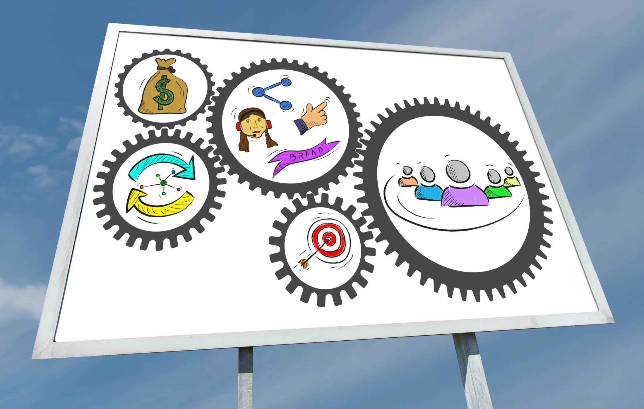
The Psychology of Billboard Design: How to Create Ads That Convert
Billboards only have a split second to perform. The most effective ones communicate instantly—clear at first glance and memorable long after commuters pass by. The formula is simple: keep your headline short and punchy, use bold, readable typography, lean on high-contrast colours, focus on one impactful visual, and end with a clean, trackable call-to-action. These principles consistently deliver strong results on Canadian highways, in busy urban streets, and through all types of weather conditions.
What makes a high-impact billboard in Canada
Context in Canada shapes everything. Long winters, snow glare, and early dusk force stronger contrast and bigger type. Bilingual markets from Montreal to the Outaouais region require layouts that read cleanly in two languages without looking crowded.
Picture a commuter in sleet. Wipers thump, road spray blurs the windshield, and there’s a two second window to catch the message. Billboards that land in those conditions share a few traits. A single idea. Big, simple lettering. A punchy color duo like black and yellow. And a call to action someone can remember or capture quickly without fuss. This simple formula aligns with creative best practices from out-of-home associations and road safety realities that limit attention while driving.
Essential billboard design tips for instant readability
Keep the message under seven words
Seven words is a smart ceiling for headlines on roadside boards. Short lines reduce parsing time and improve recall, especially for drivers managing traffic and weather. Outdoor creative playbooks consistently encourage one focused idea, a short line, and visual support rather than extra copy blocks.
Design for a two-second glance
Most drivers give a billboard about two seconds of attention under normal traffic. That window shrinks in rain or snow. Transport safety guidance treats anything that encourages longer glances as a risk, which is a useful creative constraint.
Imagery, composition, and logo sizing that tell the story fast
Single focal point imagery
One image that tells the story beats a collage every time. Faces work because people key in on eyes and expressions. Products shot large and simple read quickly. Visual metaphors can work if they are obvious at speed, not clever puzzles. Keep textures and busy backgrounds out from behind to avoid visual noise.
Brand mark and logo placement that scale
Logos anchored in a corner read consistently across formats. Bottom right often wins because it sits near the natural end of the visual path. Scale the mark to feel confident. A practical target is roughly 10 to 15 percent of the board height, larger if the name is the only CTA. Keep taglines off the logo lockup to avoid micro-type.
Canadian-specific considerations: bilingual design, climate, and compliance
Bilingual layouts for English–French markets
In Quebec and other bilingual zones, French has prominence requirements on signage. The practical takeaway for designers is to plan balanced bilingual layouts from the start rather than bolt on a second line later. Use equal weight or follow legal prominence where required, separate the languages with space or rules, and avoid duplicated micro-type that no one can read at speed. Always verify current obligations with provincial guidance and municipal bylaws before final art is released.
Durable materials and winter-friendly color choices
Canadian winter test materials. Choose vinyls and inks rated for low temperatures, high UV exposure, and freeze-thaw cycles. Specify strong adhesion systems and protective overlaminates where vandalism or road salt is common. For digital boards, confirm brightness settings that cut through snow glare without creating distraction. Favor saturated colors that hold up under overcast skies. Production partners and material manufacturers publish cold weather installation and performance guidance that is worth following closely.
The Psychology Behind Billboards That Convert - By Boomrng
Billboard advertising isn’t just about large visuals — it’s about understanding how people think, react, and remember. From colour and contrast to emotion, attention, and recall, psychological principles play a huge role in making outdoor ads more noticeable, memorable, and impactful.
Whether you’re a brand aiming to stand out in a crowded market or a marketer seeking better ROI, applying psychology to your billboard design is one of the smartest ways to maximize results. Thoughtful design helps your message stick with commuters and drives stronger engagement.
When you’re ready to create a billboard that captures attention and stays top-of-mind, partner with Boomrng. We don’t just design billboards - we craft outdoor advertising that drives real business impact.
Ready to get started? Book a Call with our team and let’s build a high-performing outdoor campaign together.
FAQ: Billboard design best practices
What is the ideal font size for a billboard?
Treat 30 to 60 centimetres as a common band for main headlines on highway boards, larger when the structure sits far from the roadway. Urban placements can read cleanly with 20 to 30 centimetres. Always test at scale in context before print, since viewing angles change results.
How many words should a billboard have?
Keep it under seven words for the headline. If a subline is required, keep that to three to five words and set it large. This aligns with outdoor creative guidance and supports quick comprehension during a two second glance.
Should I use QR codes on billboards?
Yes, when sized large, placed low, and contrasted well. Use a short URL as a backup for drivers.QR works best where stop-and-go traffic or pedestrian views are common. Always test scanning from realistic distances with average phones under daylight and dusk.
What image resolution is best for large-format printing?
Set final files to the printer’s spec, often in the 10 to 30 pixels per centimetre range at full size. That resolution sounds low compared to print, but it is correct for large viewing distances. Your print provider’s template will give exact targets. Do not upscale small web images.